

Sep 12, 2025
Design Lessons from a Floral Arrangement: Can Anything be Beautiful in the Right Context?
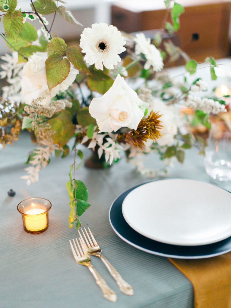
I went to a floral design conference once, and the instructor said something that’s stuck with me ever since:
“There are no bad flowers — only bad flower combinations.”
(Well… except for those rainbow-dyed grocery store roses. I think we can all agree on that.)
But her point still stands. Sometimes I see a flower arrangement and think, Yikes. That looks cheap. Or tacky. Or just… off. But maybe it’s not the flower’s fault. Maybe it’s the pairing — the balance, the colors, the context.
And that got me thinking about home decorating, color theory, and interior design choices.
Is It Really Ugly, or Just in the Wrong Setting?
What if we applied that same thinking to interior styling?
• Is that “ugly” mauve carpet really the problem… or is it just clashing with the wall color and furniture placement?
• Is the oversized sectional sofa truly hideous… or is it simply the wrong scale for the room, with throw pillows that don’t match the style?
• Are those dated paint colors a lost cause… or could they shine in the right color palette with complementary textures and lighting?
Good Design Is About Harmony
Maybe what we often label as “bad taste” is really just bad pairing. Maybe it’s not about what something is — it’s about what it’s sitting next to.
Even if something isn’t your personal style, there’s often still a way to see that it’s well-designed or beautifully balanced. It’s about learning to recognize beauty in context, even if it’s not something you’d choose for your own home.
What Do You Think?
Do you believe that almost anything — whether it’s a flower, a paint color, or a piece of furniture — can be beautiful in the right setting?
Tell me in the comments below, or share this post with a friend who’s always rearranging their living room trying to make things “work.”
Want more thoughts like this? Browse the blog for more on interior design tips, home styling inspiration and the little mindset shifts that make a house feel like home.


LEAVE A COMMENT
View Comments